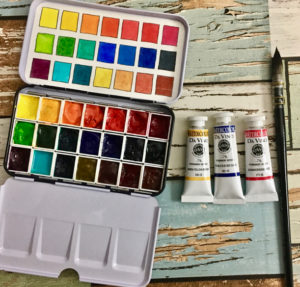
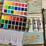
 Over the years I’ve had several iterations of my palette. If you want to read all about my thoughts and where my artist’s palette started, go here. This year I’ve gone totally Da Vinci watercolors for my 2019 palette. There are a few good reasons for that. First, these paints love me, they work the best for the way I paint. They flow and move exactly how I expect them to, which I LOVE. Second, they’re a spectacular price. Third, I do love supporting a local paint company and Da Vinci paints are made in the USA. I am Canadian but I consider these paints as local as I’m gonna get, lol.
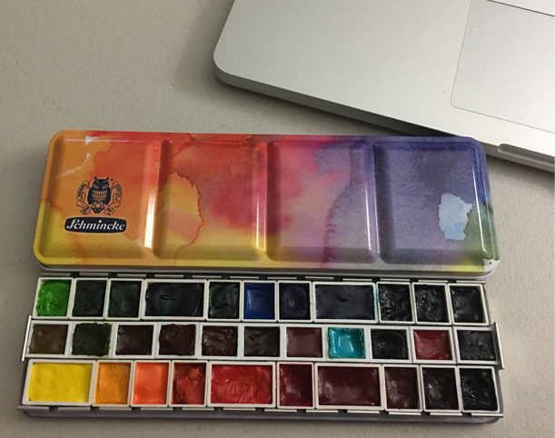
What About Your Schmincke Palette?
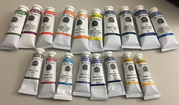
Top: 37ml Tubes, Bottom: 15ml tubes
What Are Your Da Vinci Colors?
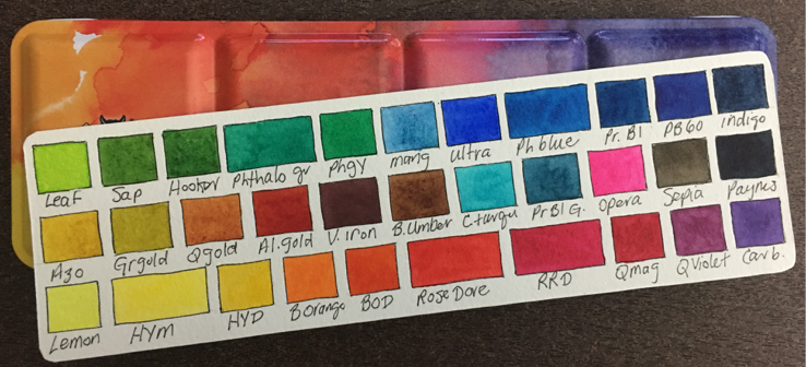
- Hansa Yellow Light (Lemon – PY3)
- Hansa Yellow Medium (PY74)
- Hansa Yellow Deep (PY65)
- Benzimida Orange (PO62)
- Benzimida Orange Deep (PO36)
- Rose Dóre (PV19+PR188)
- Red Rose Deep (PV19)
- Perm. Magenta (PV19+PB29)
- Quin Violet (PV19)
- Da Vinci Violet (Carbazole – PV23)
- Nickel Azo Yellow (PY150)
- Green Gold (PY129)
- Quin Gold (PY150+PR206)
- Alizarin Gold (PR177+PY42)
- Violet Iron Oxide (PR101)
- Burnt Umber (PBr7)
- Cobalt Turquoise (PB36)
- Prussian Blue Green Shade (PB27+PG7)
- Opus (PR122)
- Sepia (PBk6+PBr7)
- Payne’s Grey (PBk6+PB27)
- Leaf Green (PG7+PY65)
- Sap Green (PG7+PY42)
- Hooker’s Green Light (PG7+PY42)
- Phthalo Green (PG7)
- Phthalo Green Yellow Shade (PG36)
- Manganese Blue (PB33+PB15)
- Ultramarine Blue Green Shade (PB29)
- Phthalo Blue (PB15)
- Prussian Blue (PB27)
- Indanthrene Blue (PB60)
- Indigo (PB27+PV19)
Left: Van Gogh Student Grade, Right: Artist Grade watercolors
Outliers:
- Pure Yellow (Schmincke – I’ve never come across a more clear wonderful yellow and I still love this color!_
- Transparent Orange (Schmincke – Just like the yellow above, I am still in love)
- Neutral Tint (M. Graham – The only neutral tint I’ve come across that is transparent, made from PG7 & PV19)
- Moonglow (Daniel Smith – Yowza, ’nuff said.)
- Amazonite (Daniel Smith – I would either take this color, Fuchsite or Sleeping Beauty Genuine, it would be wonderful to have a transparent turquoise!)
- Burnt Sienna (The ONE color in the Da Vinci line that I just don’t love is their burnt sienna. I loved this one then also found the exact matching color in Schmincke, Transp. Sienna. So that’s what I added to my custom Schmincke palette!)
- Payne’s Grey Blueish (Gorgeous, and so lively. How to elevate Payne’s to a new level!)
There’s a lot of info to be had when using the search term “palette” on my blog. If you’d like to read any of those posts, click here. Also, if you’d like to know how I make swatch cards, click here. Learn all about a split primary palette here. My palettes are loosely based on the idea of a split primary palette except I split every main color, both primary and secondary.
 What About Plein Air?
Finally, if I HAD to cut down my colors to something I could travel with, I could get them down to twenty-one. They’d fit in a generic metal 12 half pan palette if I filled the middle gutter. Here’s my list: Top Row: Hansa Yellow Medium, Hansa Yellow Deep, Bezimida Orange, Rose Dóre, Opus, Red Rose Deep, Perm. Magenta. Second Row: Leaf Green, Sap Green, Phthalo Green, Ultramarine, Phthalo Blue, Inanthrene Blue, Payne’s Grey. Third Row: Quin Violet, Cobalt Turquoise, Prussian Blue Green Shade, Green Gold, Quin Gold, Alizarin Gold, Burnt Umber.
That’s it. Another update to my palette. I’d love to hear what you think. I know we, as artists, all love palette porn, lol. I can never get enough of other people’s choice of color. :o)


Hi Jen…May I know what pallete you use at the end to “fill the gutter”
May I know the colours you put in there, by brand, instead of just the name of the colour?
thanks Janis
Hi Jen…May I know what pallette you use at the end to “fill the gutter”
May I know the colours you put in there, by brand, instead of just the name of the colour?
thanks Janis
Hi Jen…May I know what palette you use at the end to “fill the gutter”
May I know the colours you put in there, by brand, instead of just the name of the colour?
thanks Janis..and you are screening my comments it would appear!
Thank you for all the useful information, and yes, we do love seeing artist’s palettes :).
Oh palette porn is right! Predictably I love your colours and it has given me even more to think about as I start putting together a new set of colours for 2019. Thanks for the inspiration- or is it cross pollination?!
I’m glad to see this palette post today! My mother is an artist and seems to be having a crisis of medium (which I did, too, last year, and that’s why I now watercolor) – she’s thinking about wanting to try watercolor. So I’m looking at palettes again and talking her through my favorites and all the reseach I did. She wants to start small, so no where near this size, but it’s been fun to go back through and try and narrow down to 4-6 colors, because I know I theoretically could live with only that amount (but, really, who am I kidding? I couldn’t live without my W&N Indigo or my cobalt teal). It’s interesting to think that she and I might be back in the same medium again, but also fun to look at all the palettes and really examine what a well-rounded palette looks like for each person and what their specialty is.
I would need a whole pan of that Opera – it is that beautiful! hahahaha!
What a fantastic palette. I think I have all of those colors – I may have to set up a similar palette for myself!
Love the term “palette porn”! That could be the title for a new watercolor magazine! Would make a great tee shirt too! Love your new colors…. love your Schmincke palette I bought last year, but now I’m lusting for the new colors too……thanks for all the info.
That bright pink opus is gorgeous!! have never seen a pink that bright before
when it comes to art supplies, I always say buy the best for your budget and don’t buy complete junk if you are trying out a medium since you will more than likely not have a good time with junk supplies.