 My newest Palette iteration for 2019 is a combination of my Schmicke tin and Da Vinci watercolors. Read all about it here. Below is the journey to this palette. Finding your perfect balance of color is a journey, what a fun journey it is!
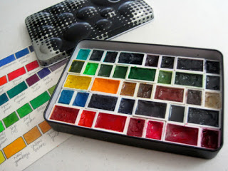
Right now, I’m using a DIY palette made from an empty QOR tin. I specifically asked for this tin for my birthday last year (it comes filled with six 5ml tubes of Qor watercolors). I chose the High Chroma set. I find it extremely difficult to remember the exact order of my paints because I have many colors in my palette, I love color. So what I’ve done is choose my most used colors and put them in full pans instead of half pans. Then I can tell just by looking which color is which, even when it LOOKS like there are a whole line of black, lol. Although it holds a massive amount of paint, my studio palette only takes up 4″ x 6″ on my table.
I love mixing color but I probably do it differently from other professional watercolorists with more experience. I tend to tweak colors instead of mixing full colors myself. The biggest reason I do this is because I find purchased, pre-mixed paint tends to be more transparent that anything I can mix myself, even if I’m using all transparent colors. I am learning over time, to mix my own full colors instead of just tweaking a premixed one though. That’s an especially thrilling thing to slowly learn. That learning only really seems noticeable if I’m talking to a family member or friend who doesn’t paint. I tend to hear, “you know so much about color!”. Then I think about how much I’ve learned this year that I just didn’t understand last year. For those of you just starting, it does sink in eventually. Just keep reading articles and blog posts about why your favorite artist use the colors they do and you’ll learn much more than you think, over time.
 MY LIST OF PALETTE COLORS:
Top Row:
Cobalt Teal (DS)
Aqua Green (W&N, Limited Edition Color)
Prussian Green (Sch)
Phthalo Green BS (DS)
Quin Violet (W&N, Limited Edition Color)
Carbazole Violet (DS)
Moonglow (DS)
Neutral Tint (Sch)
Second Row Down:
In the last few days, after photographing my palette I took out the green earth on the left second row from the top and another half pan of green, substituting these colors for a full pan of Lemon Yellow (DS)
Phthalo Yellow Green (DS)
*deleted next half pan*
Sap Green (Sch)
Hooker’s Green (Senn)
Serpentine Genuine (DS)
Sap Green (DS)
Shadow Green (Holbein)
 Third Row Down:
Pure Yellow (Sch)
New Gamboge (DS)
Yellow Ochre (Sch)
Quin Gold (DS)
Burnt Sienna (W&N)
Burnt Umber (Sch)
Buff Titanium (DS)
Fourth Row Down:
Cerulean Blue (W&N)
Manganese Blue (DS)
French Ultramarine (DS)
Phthalo Sapphire (W&N, Limited Edition Color)
PB60 – Indanthrone Blue (DS)
Indigo (W&N)
Payne’s Grey Bluish (Sch)
Fifth Row Bottom:
Transparent Orange (Sch)
Permanent Red (Sch)
Quin Red (DS)
Sanguine Red (W&N, Limited Edition Color)
Opera Pink (DS)
Permanent Rose (W&N)
Quin Magenta (DS)
Now, I’ll readily admit, some of these colors I don’t use that often. (I’m looking at you Prussian Green, Shadow Green, Cerulean Blue, Burnt Umber)…. But I own them, there’s room in this massively extensive palette, so what the heck. I can easily thin my palette down to between 14 and 21 colors with very little effort. If you already own the paint and figure out a good way of sorting your palette and you have the room though, then use the paint!
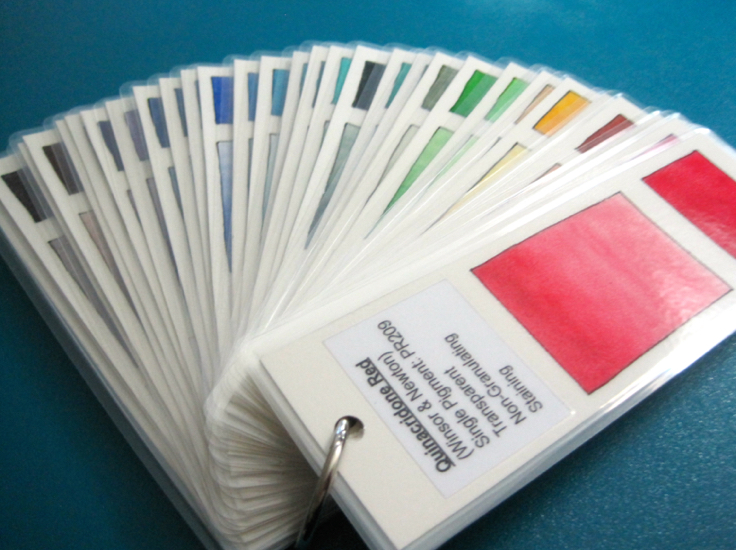 I keep all the information on my paint colors on swatch cards that I then laminate and put on a large binder ring. This allows me to continue to try and learn more and more about the paint in my palette. As I find I tend to steer away from some colors and toward others, I can study their swatch card and all their information to glean why I might be naturally drawn to or away from a certain color.
For instance, I’ve noticed over the years that I really don’t respond to opaque or semi-opaque colors. I also tend not to embrace granulation, usually. Sometimes I really love granulation, like in Moonglow, but usually I just don’t use it much. I think this is why I tend to not use my ultramarine as much as I should. When I run out of the French I’ll be getting a non-granulating iteration of that color.
Opacity on the other hand seems to be the fly in my soup, so to speak. Not only do I highly respond to the most transparent colors, but I’ve also found lately, I freak out in a great way the brighter that transparent color is. I guess I think of it this way, I can always dumb a color down, take the edge off of it using an earth pigment like yellow ochre or transparent sienna (burnt sienna in W&N). But if I want bright I can’t move up from duller colors. I love the luminosity of the watercolors I choose. Yes, I have some duller colors like Daniel Smith Sap. It sits unused much of the time until I have leaves that call for that kind of color. I must admit though, I find any mixed color with more than two pigments difficult to use. Convenience is good but if I can’t even tweak it a little without getting mud then I’m unhappy with that color. This is why, if I have a reasonable choice, I try to choose one pigment colors. So I guess the rules are transparency first, brightness second then try your darndest to find single pigment colors. This is why I’m not wholly loyal to one brand.
The above does NOT apply to three colors in my palette, Moonglow, Payne’s Grey Bluish and Neutral tint. These colors break every rule I just espoused above. They’re all three pigment mixes, Moonglow is granulating and the other two are semi-opaque! They are also three of my very favorite colors, for one reason. I use each of them for different kinds of shadows and tend to never use them in mixes. Much of the time Payne’s grey Bluish is my goto cast shadow color. I usually put the color of the object as the first layer in the shadow then glaze over that with darker and darker versions of Payne’s. I tend to use Neutral tint and Moonglow as shadows on objects themselves. Both colors have a purple tint so I find it feels warmer than the bluish Payne’s. I like to use two different colors for my shadows, depending on where they are, to give interest and life to what I’m painting. All the same kind of shadow can be repetitive and boring.
Finally, the best advice I’ve gotten so far about the use of color is about the Pure Yellow I use. I start nearly every single painting with a layer of this color, using it strongly if the subject is in that yellow-orange-red family and weaker if it’s not. Pure yellow (Schmincke) is incredibly transparent, clean and bright and it’s nearly a primary color. It brightens any other paint that it is an underpainting for. I glaze a lot and starting (and many times finishing)with a glaze of this yellow ensures a glow to everything I paint. Strangely it doesn’t affect the actual color of the thing I’m painting. If I’m painting a cool red flower the tint doesn’t all of a sudden veer into the orange range. Pure yellow just lets the glow shine though, much like sunlight on a flower. It is also a great way to bring back an overworked piece. Glaze it with Pure Yellow (Schmincke) and it tends to bring back that glow. Similar things happen with Opera Pink on blue, purple and red things if the yellow just isn’t enough because I’ve truly over-glazed. Opera is a transparent neon so obviously it has it’s own glow, lol. Don’t worry that it’s fugitive, since it’s mixed with other highly stable, lightfast colors you have nothing to worry about.
Hopefully this info can help any newer painters out there. Feel free to leave a comment on any newer post and tell me if the information above helped you. If you have any questions just yell for help, I’m here to serve. :o)

