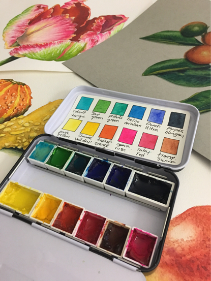
 The term “SPLIT PRIMARY” palette is thrown around so much in artist circles. I used this concept to choose the watercolors for the 2018 Custom Schmincke Palette. Let me explain just exactly what a split primary palette is and why it’s considered the gold standard when setting up your own palette (especially for a traveling).
First things first.
WHAT is a split primary palette? Well, primary refers to the three main colors that all other colors are mixed from. Red. Yellow. Blue. A split primary then would be, each primary color divided into two parts or two shades of each color. So, two reds, two blues and two yellows making up the core of your palette. What makes most sense is having a warm and cool shade of each of your primary colors, allowing you to mix the most wide ranging amount of other colors possible.
What does Warm & Cool mean?
A warm color has a yellow base. A cool color has a blue base. This easy to remember designation will serve you well in many cases. Sometimes though, like with blues, it does get a little more complicated. So let’s start with reds, the easiest of the colors to break down.
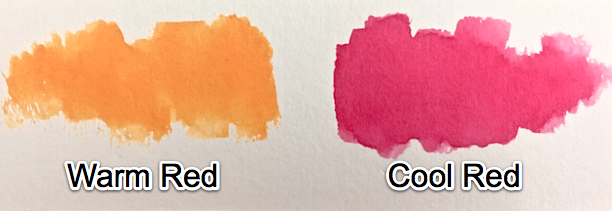
A WARM red has yellow in it. So, all orangey reds and all oranges are warm. A COOL red has blue in it. So all blue based reds like permanent rose, carmine, scarlet etc and all purples are cool.
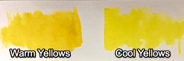
COOL yellows have a slight blue tint to them. The above right is actually Hansa Yellow Medium, a very primary yellow, not cool and not warm, it’s like Goldilocks, juuuusssst right. On the other hand, in comparison, on the left is Hansa Yellow Deep, very similar to New Gamboge. This is a warm yellow. As you can see, it has no blue in it at all and actually leans toward the orange side.
This is where it gets a tiny bit more complicated.
So to simplify it, let’s talk about the rainbow.
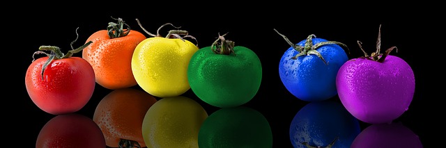
Red, Orange, Yellow, Green, Blue, Indigo, Violet
Those are the colors of the rainbow, in order from warm to cool. This is based on the color spectrum. Red is the warmest color, Violet (also called purple) is the coolest. When yellow is cool, it has some blue in it, it leans toward the blue tomato. When Yellow is warm, it leans toward the RED tomato. Does that make sense?
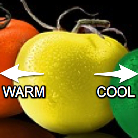 Think of the YELLOW TOMATO in three parts, the left is New Gamboge (an orange-yellow) and a warm yellow. The center color is a true primary, like Hansa Yellow Medium (no orange or blue in it). The Right side of the yellow tomato would be the cool side, like lemon yellow, with that green undertone to it. It is leaning towards the blues.
Ok, onto BLUES. This is the one color I’ve had trouble with for YEARS. Finally, I figured out why. I read an article @sharonhicksfineart. She aptly pointed out the problem I and many other people have been having.
We were taught the COLOR WHEEL but the spectrum is a STRAIGHT LINE, not a circle. So when we see the purple/violet beside the red on the color wheel, that’s WRONG. This indicates that it’s warmer than say, blue or green. THAT IS WRONG. Purple/Violet is the COOLEST color on the light spectrum. Look at the tomato line above. Purple is on the very right, not next to the RED tomato at all. So stop thinking like a color wheel and start thinking like a color spectrum, a straight line! Now you’ll have less trouble discerning which blues are warm and which are cool.
If a blue has green in it, it’s WARM. In other words, we make green by ADDING yellow to blue. YELLOW is a warm color, so any blue that has yellow as an undertone or leans toward the green side of the spectrum line is WARM. On the other hand, if a blue is more purple based, it is cooler because purple is cooler than blue. The blue is leaning toward the purples. YAY, it must be COOL.
Other Opinions…
Unfortunately, you WILL find many, people and artists who will tell you that blues that lean toward the red side (the purple side) are warmer than the ones that lean toward the green are cool. This is because they’re using a color wheel. It’s just a different way of thinking of it. I actually have a solution to help, so it stops mattering whether you call a blue warm or cool.
The reason we WANT to know or even CARE why a blue is warm or cool is to mix colors accurately. Here’s the problem:
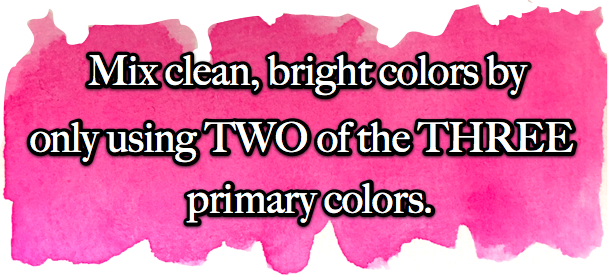
That means, for instance, if you’re trying to mix a truly bright (not muddy at all) purple, you want to ONLY be using colors with red and blue in them. That would mean NO WARM REDS (because they have yellow) and NO WARM BLUES (because they have yellow in them). You only want cool reds like permanent rose or quin magenta. And you only want cool blues like phthalo (red shade) & indanthrone (PB60).
This same concept applies to mixing both greens and oranges. For greens, you mix blue and yellow. So for clear greens you want NO red in your color choices. That would mean your yellow should be either primary like Hansa Yellow Medium or lemon yellow. Your blue should be a warm or mid blue like cerulean or even cobalt turquoise.
For mixing the cleanest oranges, you want no blue bias to your red or yellow. This is not to say that you will get ugly oranges if you mix a permanent rose with a warm yellow like Hansa Yellow Deep. It’ll just be a tiny bit neutralized and not the absolute brightest orange you could get.
Learn By Doing!
The best way of learning about your colors is to do mixing experiments, looking for HOW you get the brightest colors and how you get more muted colors too.
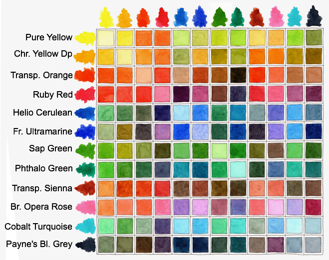
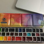
Look at the mixing chart for the 2018 custom Schmincke Palette. See the brightest as opposed to the neutralized, duller, more muted colors. Figure out WHY you’re seeing what you’re seeing.
The Reasons WHY We Want A Split Primary Palette
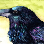
… because then you’ll always know how to get the color you want to mix. If you want a clean, clear leaf green as opposed to an olive-y type green, you’ll know which yellows and which blues should be used to get that. knowing the foundation, bias or lean of your watercolors lets the artist be more accurate. And if you know how to mix your colors accurately, you’ll know how to get olive-y greens and burnt reds and deep brown-blacks like in my painting “Badge of Honor”.
![]()
Another Piece of Advice From A Friend…
A few weeks ago I was perusing blogs and came across Tonya’s blog (Scratchmade Journal). I love her blog, it’s like a terrific hive of information! I gleaned a little nugget of useful info that I DIDN’T KNOW! Here it is:
“Filling your palette with a balance of warm and cool colors is a great way to expand your mixable palette and create a beautiful feeling of depth in your paintings. After all, cool colors tend to recede visually in a painting, while warm colors appear closer. A combination of cool and warm shades gives artists a great manipulation tool!” (Thank you Tonya @ScratchmadeJournal)
One Last Thing:
This is the most nervous I have been putting out a tutorial blog post. All this shifting of color in the blue spectrum is “new” to me. I’ve known about split primaries since I was knee high to a grasshopper but I’ve always had trouble with BLUES. I don’t seem to see them like everyone else. So, if you find the information above NOT useful or even worse, NOT accurate then just ignore it, lol. I have spent the last six months trying to wrap my head around my problem with blues and I think I may never know where ultramarine sits in the color spectrum as opposed to Phthalo blue red shade. To me, ultramarine seems much greener than my favorite Phthalo (RS). Who knows why because so many say it’s a very purple blue. I don’t see that in Ultramarine, but to each his own.


You make it all understandable. I do think blues are the hardest – probably because there seem to be fewer blues than yellows and reds.
Blues drive me batty as well and ultramarines win for most confusing color (well, maybe the Pbr7 vs PR101 burnt sienna debate comes close). I recently happened upon a video by the owner of Daniel Smith who refers to French UM as a RED shade and ultramarine as a green shade. He explained how this happens because the pigment is ground to a different size for each and they then refract light differently. I find that an interesting idea but I don’t myself see it in the colors. And then who knows what other manufacturers think on that front although Schmincke’s UM finest is ground so finely it doesn’t granulate (and their French UM does).
I have too many colors on my palette (according to any Palette Police handing out color speeding tickets to newbies like me lol) and BLUE is probably my biggest challenge. Their are blues that I personally like (cobalt blue, indanthrone, and prussian blue (mixes lots of landscape greens) ) and then there are blues I feel “obligated” to have like UM/FUM and pthalo blue GS. Oh, and lets not forget manganese blue hue and cerulean blue (I’m still trying to decide which I use more!) or cobalt teal (like having a jewel in my palette). I have a MUCH easier time containing myself on the yellow and red fronts. :-).
I’m a bit intrigued that you think of your palette choices as a split primary when with the addition of the violet from your extended color options, the palette also functions as a secondary palette. :-). I’ve been reading more on the split primary vs secondary “debate” lately and a big argument FOR a secondary palette are the very clear, “pure” secondary colors on it.
Lots of fun thinking around all of this!
More great info! Hope you are doing well!
I think this makes perfect sense! I wish I’d had this information when I first began painting. I was told to have a warm and cool of each primary, but was never told the why of it. Thank you night school courses. I have to admit, though, that learning by doing works best for me. Blues are tricky.
Thank you! I don’t really care what they’re called, I see colors closer to yellow as warm and closer to violet as cool. Now if I could just catch the light like Sorolla 😉
This was SO SO helpful to me. I’ve been reading about color temperature and mixing theory for over a year now, from all different “expert” sources, but this was the first article I read that I did’t walk away scratching my head. Many thanks!!
Hello Jennifer, I have a science background (chemistry) and it makes me nuts to see how confused the art world is about color primaries. It’s really helpful to understand what physicists have to say on the subject, which can be discovered by looking for color articles with an edu extension. So much of what we take as obviously true turns out to be shaky ground. Here are some think-outside-the-box questions for you. Why do we assume that the traditional red yellow and blue are primary? What colors does your printer use to make all other colors? What is warm about red? What is cool about violet? Are the terms warm and cool even helpful (for knowing which blue is closer to green for example)? Have you ever tried to make purple by mixing a good quin magenta with phthalo GS? You do mention that orange made with magenta isn’t too bad, so I won’t ask you that question. How familiar are you with the CMY palette? What are the secondary colors in the CMY system? Well enough for today. The split primary palette, for all its inaccuracies of theory, will nonetheless work well as long as cyan magenta and yellow are included, with red and blue serving as secondaries.