I use some watercolors in very specific ways. They aren’t just in my palette because they help me paint a subject in certain colors. These colors are workhorses in my palette. Let me explain.
I go through Pure Yellow, Brilliant Opera Rose, Neutral Tint and Payne’s Blue Grey faster than any other watercolors in my palette, by FAR. In fact, three of the four of them are perpetually in a full pan instead of a half pan. I’d be refilling them weekly if I didn’t double up on their size in my palette. Each color is used quite differently.

Pure Yellow
I use this highly transparent primary yellow (not too red, not too green) as an underpainting for all my work. It’s like adding the sunshine to the painting before you even start. Putting a glaze of this yellow under everything doesn’t change the colors that you glaze overtop of it, but it does brighten them considerably. When I’m painting something red-orange-yellow like tomatoes then I use it strongly. If, on the other hand, I’m painting something blue-purple then I use less of the Pure Yellow as the underpainting but I certainly DO use it. It makes a dramatic difference in the luminosity of your paint and the power of your paintings.
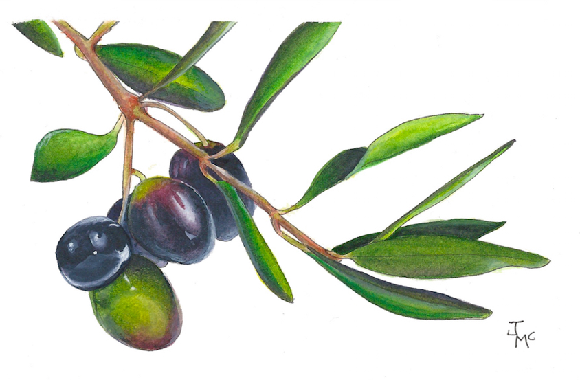
Title: “Deconstructed Olive Oil”
Use pure yellow overtop of paint that you want to brighten. Sometimes you’ll find that parts of your painting aren’t as bright as you want them to be. For instance, when I do branches I sometimes find the browns I use and mix aren’t as luminescent as I want. A little pure yellow glazed overtop will brighten it. This works best over subjects that are brown, green, yellow, red or orange. If you have blue or purple subjects, use opera.
In the olive painting above, I used this technique of glazing with Pure Yellow over and over again on nearly all of the leaves, stem and green olive. Brilliant Opera Rose was used over the “black” olives so they didn’t look to dull compared to everything else. This technique applies if you’re using any transparent, pure yellow (not too warm or cool) or any florescent opera (PR122). But Schmincke Brilliant Opera Rose is hands down my favorite!

Brilliant Opera Rose
this watercolor is fugitive (which means it’s not lightfast) and many artists don’t have it in their palette for that reason. In fact, for years I had banished it from my palette. I asked my good friend and guru, Tracey Fletcher King about it. She uses Opera and says if you’re mixing it with other highly lightfast colors then you should not have a problem. She’s never seen any problem with her art fading. Brilliant Opera Rose is such a unique color that cannot be made from other paint combinations. Since I can’t get it any other way, I choose to take the very small chance that it may fade in my artwork. I scan all my art just in case. Since Opera is a florescent color, it would be unusual to use it by itself anyway. I use it as a glaze when I’ve over worked a painting. With it’s florescence, it functions as a brightener.
When you overwork a painting, the luminescence dissipates, colors look duller all of a sudden. This happens when there are just too many layers or too much lifting, scrubbing and moving paint around. It’s like the section becomes muddier and looks more opaque. The painting loses is’t “life”. When I do this, I’ll use the Brilliant Opera Rose in a strong mix and glaze over the area. Most of the time it makes a difference and I can salvage the painting. I love that. The way I usually use Opera is to save a painting. If it does eventually fade, then the painting without it would have been lost anyway.
 Payne’s Blue Grey
Yes, my goto shadow color. I love the strange shade of this “black” color. I find it has so much LIFE because of that blue tint. It also feels cool when you look at it so it works so well for cast shadows.
When I’m doing a shadow I usually start with a little of the color of the object first, just a diluted amount. This would be the reflection of the object in the shadow. Then, after that DRIES (patience people!), I add a dark mix of the Payne’s. I put it right next to the object. Then, when the shadow is still wet, I clean my brush and with that lightly wet brush, I just touch the paper at the edge of the Payne’s. This will pull the paint down into the lower portion of the paper where I want the shadow. If you think it’s too dark, then pick up a little of the color. But remember, watercolors always dry lighter. After this dries you’ll then want to go darken right next to the object again.
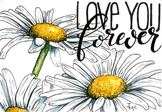
The above painting of daisies wouldn’t be anything without that Payne’s Grey Bluish. with white paper and white daisies, it was boring and flat. When I was doing this one, I found myself frustrated. I couldn’t get that punch to happen. When I look at my work, I want it to jump off the page. Since this painting also has bold lettering to compete with, those daisies had to STAND OUT. Finally I just got bold with the Payne’s and the painting finally came together. Those shadows had to be MUCH deeper than I originally thought.
One of the biggest mistakes I see is not putting enough dark shadow right next to the object. Shadows are very important to any painting. They can make or break a piece. I know it’s scary, but it’s better to learn to lean into discomfort and know you’ll get success more than failure. If you can learn that you WILL be uncomfortable as you push yourself to take risks with your art, you’ll find it easier as you encounter that feeling. You’ll know when you feel that feeling, you’re in the right place.
(Thank you Tracey Fletcher King for teaching me that Oh so valuable lesson. I now LOOK for that feeling. LEAN INTO DISCOMFORT is one of the best pieces of advice I’ve ever gotten.)
On that note about leaning into discomfort… it reminds me of another spectacular piece of advice she gave me.
ALL paintings go through an ugly phase. Kinda like a gangly teenager, lol. Sometimes that phase lasts longer than expected, but don’t give up when you hit ugly because beautiful just might be around the corner and if you stop, you’ll have missed it! Don’t give up on your ugly duckling!
I’ve had paintings that stayed in the “ugly” stage for nearly the entire time I was painting them. Then at the very last minute when I was about to throw in the towel (sometimes literally, lol), they pull out like a jet just inches from crashing and burning. I have learned,
 Neutral Tint
This is my other dark shadow workhorse watercolor. I really LOVE this color. It has such an interesting purple lean. I find it helps to add interest to a painting when the shadows within an object and the shadow on the ground are different colors. All shadows are made up of many colors and I think that when the shadows I put in a painting are all the same, the painting looks less unique. I’ll tend to use Schmincke Violet then use the Neutral tint in the darkest areas when I want even more transparency in my shadows.
Other Workhorse Watercolors
Sometimes, like when I’m doing leaves, anything other than transparent colors can dull the look. Leaves are so unique in nature. It’s one of my biggest challenges when I’m trying to make leaves that are all “one” color on a plant look different from one another. Sometimes I look at a plant and think:
It’s ALL green, but it CAN’T be all the SAME color or I wouldn’t be able to distinguish between one leaf and another. But all I SEE is GREEN!!!
It can sometimes be so hard to SEE the difference with your eyes. But your brain knows different. I find transparency helps with this. Varying my greens and trying to keep everything as transparent as possible seems to add a liveliness to the painting. I want the leaves to feel like they’re undulating on the paper. Like you can feel a breeze against your skin.

Using deep purples, phthalo green, PB60 and Neutral tint to POP those leaves!
One last thing that I’m reminded of when talking about leaves. When I get frustrated as I struggle to get definition and uniqueness to leaves in a painting, I usually finally grab some PB60 (Dark Blue in Schmincke). I throw it in the deeper places. I use it purely and darkly. This can define a leaf as much as Schmincke Violet can.
When the Neutral tint isn’t giving me the oomph in leaves that I’m looking for, I want something brighter and a little unusual. So it’s either the Schmincke Violet or the Dark Blue. It makes the greens look more unique, as though I’m finally thinking outside the box. So when I keep seeing leaves as “just green”, that’s the time to break out some deep and slightly unusual choices to bring those leaves to life.
Watercolors I’ve Mentioned:
- Pure Yellow
- Brilliant Opera Rose
- Payne’s Blue Grey (also called Bluish)
- Neutral Tint
- Schmincke Violet
- Dark Blue (PB60)
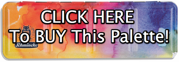
Several of the colors in this, the newest 2018 Custom Schmincke Palette, are the ones I talked about above. I chose this palette and I’m thrilled to be involved. Click on the picture to purchase. Learn all about this gorgeous tin and the colors within it here. Read all the blog post related to this Schmincke Palette here.


Love this!
Super information. I must try them all!
Your color choices are so up my alley. Opera rose is in every palette because it mixes so beautifully. Especially with paynes grey. I love the moodiness and beautiful transparent range of hues. eye candy! I’m so excited to get your palette in the mail 🙂
This has become possibly my favorite post of yours. This is my third or fourth time looking at it. Great tips, I got tubes of the yellow, opera pink, the blue and the violet. I have enough of the other colors from other brands. I have not seen a yellow quite like that in any other brand. Thank you for this post! The tubes were my compromise from getting the new palette. I have most of the colors in the new palette already.
And I thought I was the only teacher who confessed to students that we gotta get thru the butt ugly befor we get to the pop!
Great information! I’m a self taught artist and I’ve read some watercolor books so I need all the help I can get! 😀
This is a great article. I am awaiting my Schmincke 2018 custom palette and am looking forward to trying out, your underpainting and glazing suggestions. would love you to do a video demonstration of this here or on instagram. Also great to know it goes through an ugly stage as a relative newcomer to watercolours I often feel discouraged!
Thanks Jenn, for this article. I am just starting to use my lovely 2018 Schmincke custom palette with he extra colors you suggested and I am in love with ALL the colors! This article will really help me in using them to their best advantage. This is so much fun! 😘