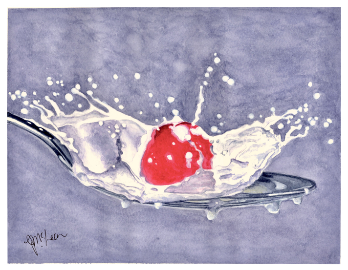
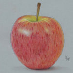
I realized today that I forgot to share this hyper-realistic piece with you all. This painting was done as an entry into Hahnemühle’s calendar contest, subject: RED. I wasn’t sure when I started this one if I could actually achieve it. Anytime I attempted hyper-realism it was with a colored pencil. Pencils that are sharp are so accurate and I wasn’t sure, without practice, my brush could even come close.
I don’t love the background. The background went in after the piece was painted. But overall, I was surprised at how well the details popped. I titled it “Photo Bomb” for obvious reasons, lol.
This painting was done on Harmony Hot Pressed watercolor paper. I have previously mentioned that LOVE Harmony rough so I’m not surprised to find that painting on Harmony HP was also a good experience. Here’s all about Harmony (review coming soon).
The Specs:
- 140lb/300gsm watercolor paper for all wet media
- Akadamie, alpha-cellulose based
- Light resistant, archival & acid free
- Natural white & surface sized (making is resistant to damage from erasers)
- Comes in cold pressed, hot pressed & rough
- Is the only watercolor paper to come in all three surfaces in a spiral bound format!
If you’d like to purchase any of the kinds of Hahnemühle paper that I use and talk about, just use this landing page, “Where To Buy“.
On other fun news…
Two exceptionally cool things arrived in the mail yesterday.
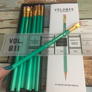
- My new Blackwing 811 pencils (they glow in the dark people!)
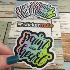
- My new “Paint Your Heart” stickers from StickerMule. YAY!
Ok, photos? Yes please. Well, if you insist. ;o)
 |
 |


Yes I would, they look amazing.
Certainly, who wouldn’t wont a glow in the dark pencil.
Oh, yes. You bet! Love your “Photo Bomb”!
Jennifer – I missed this “Photo Bomb” painting! I ALWAYS love your work!! May I say “AWESOME?”