I decided a few years ago that I wanted to play with a little hand lettering. To be honest, I’ve always had a fascination with calligraphy and hand lettering. I’m a lefty, I’ve had hit and miss handwriting all my life. Sometimes it looks spectacular, other times it totally sucks and is unreadable! I wanted to improve my lettering and hope to not only add another skill to my quiver but also improve my handwriting at the same time.
The first thing I learned is that hand lettering has very little to do with hand writing. With hand lettering, you’re drawing letters, not writing them. So, my writing wasn’t gonna improve just because I picked up lettering. Damn. I’m still all in though. I want to add this skill to my repertoire.

Of course, I did what you’re probably NOT supposed to do. I trolled the internet for examples and started playing with lettering. My approach was much like the way I began watercolors. I threw myself at it without having any idea how to learn. The good news is that both skills, hand lettering and watercolors, hav boat loads of lessons on YouTube and tons of examples on Instagram.
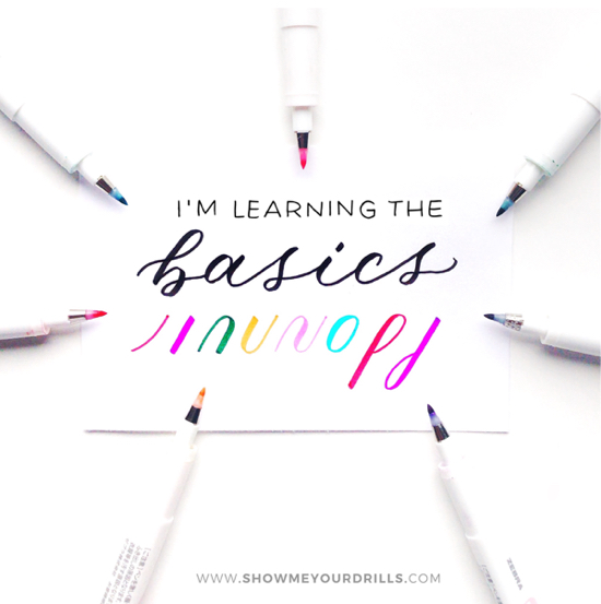
After going it on my own, plundering, trying, failing etc, I realized I had to do better. So, starting Monday I’m participating in “Show Me Your Drills” with Becca Courtice (@TheHappilyEverCrafter). THIS is the way to learn calligraphy and hand lettering, start with the basics. Oh, did I mention the course is FREE?? Yep, come join me if you want. It has a facebook group too. I’m looking forward to committing to lettering and calligraphy so I can be more proficient. I want S.K.I.L.L.S.!!
I’ve never done drills.
This involves learning the strokes involved in producing letters. Instead, what I did was look up pretty words with bouncy lettering and learn by copying them until I got the strokes. This way didn’t teach me how to produce my own lettering but it did get me started. It’s only in the last few months that I’m starting to “get” it.
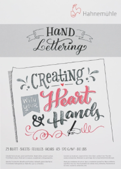
I’ll be using a light box and the printed drill sheets with an overlay of practice paper (Strathmore drawing paper) to complete my daily assignments. You can also forgo the lightbox (this is the one I have and I really LOVE it) and use tracing paper over your drill sheets. For good copies of lettering I will be breaking open Hahnemühle Hand Lettering pad.
 |
 |
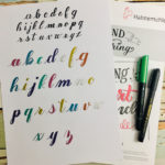
Paper & Pens
The Hand Lettering pad is super smooth paper in (A3, A4 & A5 sizes). It’s bright white so your colored brush pen ink is clear and brilliant. The paper is 170gsm/80lb and you get 25 sheets per pad. The way brush pens flow over this paper is sublime. Smooth paper is what you really want, this protects the precious pointed nibs of your pens for a longer time.
There are two main sizes of brush pens, large and small. Large lettering is done with pens like Tombow’s Dual brush pens that come in 108 colors. Then there are small brush pens (that come in small, medium and large within this category, yep, a little confusing but go with it.). I’m using Zebra’s brush pens for this size. You can get the three small sizes in one pack here.
Most of my lettering and all of my practice has been done using Zebra brush pens. I bought a big bunch of them when Zebra had a sale and then was lucky enough to become a Zebra Ambassador. I’m hoping to be able to test out they’re new colored brush pens and they’re awesome looking metallic brush pens too.
Why Zebra?
I have tried other brands of brush pens like Tombow’s Fudenoske but love the Zebras the best. They’re brush pens and technical liners are why I went after an ambassadorship, I loved them and I want to support the products I love. And I’m hard, I mean seriously HARD on the nibs. Since I’m left handed, I put extra pressure on the nib to control my downstroke. I find the Zebras bounce back much better than other brush pens. Because I’m so hard on brush pens, I use a few only for practice and when I’m doing a “good copy” I use a new or newer nib.
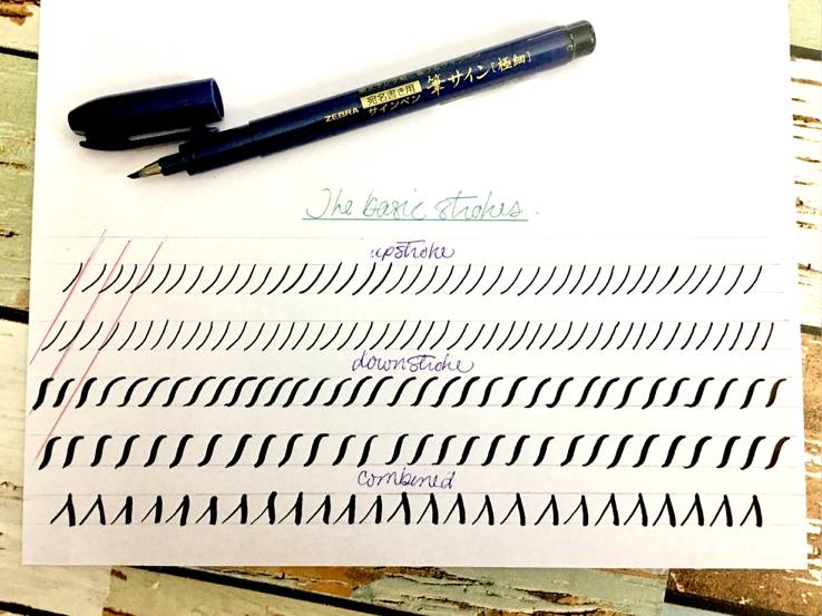
Oh, since I mentioned downstrokes, the first lesson in lettering and calligraphy is thin lines on the upstroke (when moving the pen upwards) and thick lines on the downstroke, as you move the brush pen down. This translates to pressure on the downstroke and almost no pressure at all on the upstroke.
You’ll probably find, like I did, that your upstrokes are wiggly for a while and your downstrokes are more consistent. I also found, as a lefty, that my transitions from down to upstroke were inconsistent. It takes practice to get the right pressure and to learn when to release the pressure on the brush pen.
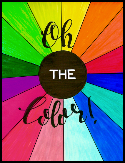
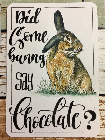
Let me show you my progression in lettering through art.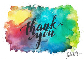
 |
 |
 |
 |
 |
 |
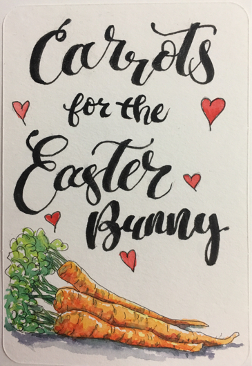 |
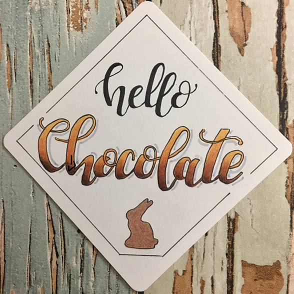
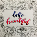
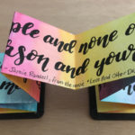
As you can see, my lettering is a little hit and miss. It generally looks ok but lacks consistency. On the same card, the “h” can look different in two different words, same with the A’s. Some letters are sublime. My L’s, my V’s, love them! On the other hand, my M’s and my N’s suck. LOL. The project below with Hahnemühle’s new Zig Zag book turned out beautifully though. My cousin should be receiving it in the mail tomorrow! YAY!

Being left handed makes a difference.
I have to “push” the pen instead of pull it through the curves sometimes, hence the problem with M+N. But I think I’m finally seeing an improvement. I also find the juiciness and flexability of Zebra’s brush pen helps with that.
I love the “Hello Chocolate”, that’s ALL ME!! As is the video, below, to show the lettered quotes I did in the Zig Zag book. All of that was my own hand lettering, no looking up better ways to do a swoopy “S”. I was also using the Zebra brush pen (largest nib). Did I say I love this pen? Yup, my fave.
Here’s the video if you missed it in my previous post.
BTW, if you’d like to purchase any of the Hahnemühle products included in the above post including the Hand Lettering pad, tin of postcards, You Tangle tiles or the Nostalgie sketchbook, then use my handy “Where To Buy” guide page. I do really appreciate any of the links from Amazon you use to purchase product, I get a small amount for each sale. This costs you nothing but really helps to keep the doors open here. Thank you for your support.


Your lettering is so much better than mine, I can’t imagine that you need improvement! But I know how that goes – I’m looking forward to seeing what you create in the future!
Such gorgeous letter pieces! You are really rocking this!
I love your art examples with lettering Jenn! Your journey is interesting to me. I started doing lettering when lettering wasn’t a “thing” (we are talking DECADES ago). I loved calligraphy growing up and used to make a lot of giant signs with different kinds of drawn out letters in high school for assemblies/sports events. Hopefully my old high school replaced the carpeting in my social studies room long ago – it had a big black spot in the middle where I dropped a bottle of india ink (I was taking notes with my calligraphy pen – long before we had all the cool, new, contained pen options available today!). I remember that the first pen I got came with a basic lettering book and I would do all those stroke practicing exercises 🙂 Enjoy your class!
the lettering looks great 🙂 i am way too shaky to try this lol
I think your lettering is quite wonderful, especially with your art! Sounds like a perfect partnership for you:)