Extra Colors Suggestions
 I don’t know if you’ve heard but Wet Paint has a New custom Schmincke palette that is on Pre-Order now. I have talked all about what’s in the palette and what you get HERE but I thought I’d talk about extra colors you may want to add to that palette.
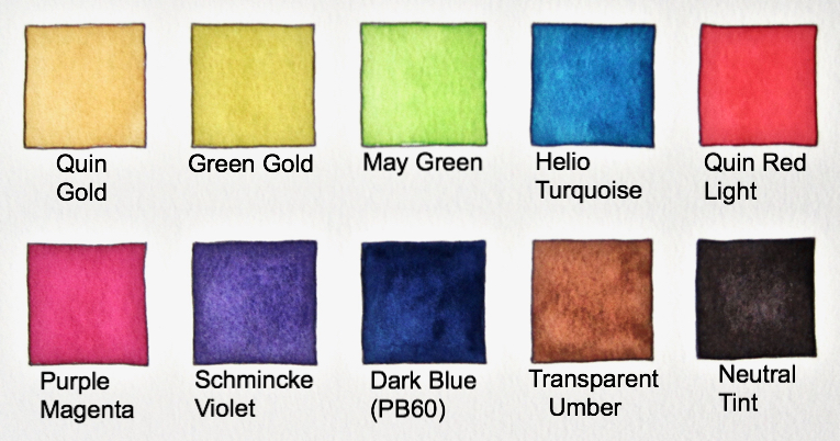
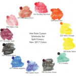
The tin comes with twelve half pans and space for another twelve. I’m going to give you suggestions of ten other colors you might want to add to flesh out this beautiful palette.
SCHMINCKE VIOLET
As you know, we already have a split primary thing going on with the half pans that come in the set; a cool and warm of red, yellow, green and blue. So to expand on that theme, my first two suggestions would be purples (also called violet). The two I’m suggesting are Schmincke Violet and Purple Magenta.
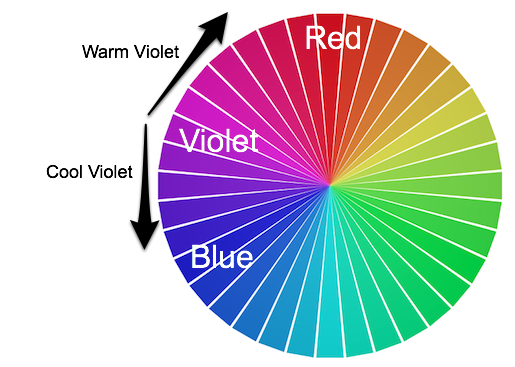
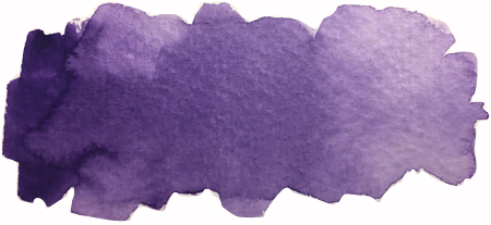
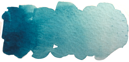
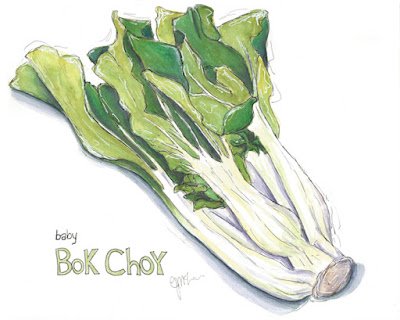 One of my favorite purples in the Schmincke repertoire is Schmincke Violet. It was the first one of the extra colors I added to my palette years ago. This pigment, PV23, is also called Dioxazine Purple or Carbazole Violet. It’s a very strong, rich color and it’s a cool violet, on the blue side. I use this color for interesting shadows, when the painting otherwise would be a bit blah. For instance, with this Baby Bok Choy, it’s all greens. To liven it up, I added the Schmincke Violet in the deepest recesses of the leaves and in the shadows. I paired it with my goto shadow color, Payne’s Blue Grey. The violet punches up the greens so they look more alive.
Yes, it’s hard to see the Schmincke violet but know, it’s in the deepest shadows of the leaves and the shadow the veggie casts. Without it, the shadow, greens would look much more dull and lifeless. It’s amazing how this color can be used to liven up shadows.
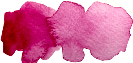
PURPLE MAGENTA
The second purple is on the warm side of the spectrum and will pair nicely with that ruby red (already in the Schmincke Palette), moving seamlessly along the color wheel. This is just such a rich color that it was an easy choice. To me, it looks like a deeper, richer version of quin rose. They are not the same pigment though, so please note that. Quin Rose is PV19 and Purple Magenta is PR122. I will be discussing why an artist might want to learn pigment information in future posts so watch this space. :o)
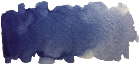
DARK BLUE (PB60)
The next additional color would be what I lovingly refer to as PB60. It’s usually called something like Indathrone blue or indanthrene blue but Schmincke calls it Dark Blue. Yes, not a very creative name but it’s a spectacular color. I learned all about it from Roz Stendhal of Rozwoundup. Actually, she’s who connected me to Wet Paint as she lives in Minnesota and they are her art store. She doesn’t know that, I was a blog lurker back then, lol.
PB60 is one of Roz’s favorite colors and I can see why. It’s as rich and saturated as Schmincke Purple and nothing really takes it’s place in a palette. Dark Blue is a color I respond to immediately, like looking at a pair of patten leather shoes but in deep blue. It’s a terrific mixer and works to make huge amounts of blues, greens and purples. PB60 is considered a warm blue as it leans toward the violet side of blue as opposed to leaning toward the green side. More about color theory and split primaries etc in subsequent blog posts.

QUIN GOLD
My next addition would have to be Quin Gold. Ahh, what a significant color. Some artists choose yellow ochre, others, like me, love quin gold. I actually have both but if I was choosing just one, Quin Gold would win hands down! It’s an earth color and works hand in hand with Transparent Sienna. It makes the most beautiful olive green when it’s added to Phthalo green, much like Daniel Smith’s Sap.
TRANSPARENT UMBER
As another palette addition, I also think anyone who doesn’t love mixing and fiddling would use transparent umber. It’s always convenient to have a brown and this one is gorgeous, transparent and so useful. Besides, good browns can be hard to mix.
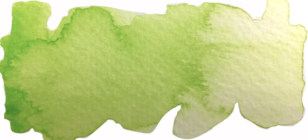
MAY GREEN
May Green is my next suggestion. You can mix this color but if you’re like me, you use so many greens that this is a great convenience color. With this one I can now mix lighter greens and get so many different colors when I start trying to capture the multicolors in leaves. It’s also just so cheery!
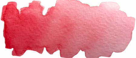
QUIN RED LIGHT

Uses several extra Schmincke colors (Schmincke Violet, Quin Gold, Quin Red Light etc.)
A pure red that isn’t either orange or pink leads me into Quin Red Light. It is always nice to have a red that doesn’t lean any which way. It works both as a stand alone like a Christmas red and also is a spectacular mixer. Yes you can mix it and many artists choose to do that.
If you’re more like me and want to tweak colors instead of fully mixing them, then all these colors make painting that much easier. It’s only now, almost six years after purchasing that 2013 custom schmincke palette that I’m starting to cull my large studio palette. Now that I know how to paint successfully, I feel ready to start to learn how to also successfully mix my own colors.
For instance, when I’m not using my Schmincke watercolors, I am now mixing my own Payne’s Blue Grey. All those years ago I wouldn’t have known how. Now I’m confident that I can learn. I had to choose to learn something first and I chose how to paint, color mixing could come after.
TRANSPARENT GREEN GOLD
We have two more convenience colors that are just pretty and so useful. Green gold is so popular with many artists. It is used in many places that have olive-y leaves and greenery. I know it’s very popular in Australia for certain kinds of shrubbery.
Helio Turquoise is the big brother to cobalt turquoise (that’s in your 2018 Schmincke palette). As I’ve said before, I love turquoises so having this in my palette wasn’t a difficult decision. It can also add great deep color to greens and even better, it’s semi-transparent, unlike the cobalt turquoise. If I need a turquoise but also need it to be transparent, this my go to color.
HELIO TURQUOISE
Finally, I’m suggesting one more dark neutral. Really, the dark neutrals act as your “black” in your palette. Buying a black like lamp black or ivory black isn’t very popular with many artists. Like me, many of them think the blacks you can buy are just too dull compared to all the brightness of the transparent colors. But I didn’t want to mix my blacks every single time I used them. Hence purchasing Payne’s Blue Grey and Neutral tint.
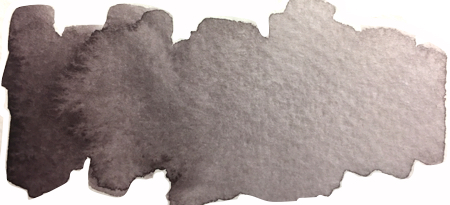
NEUTRAL TINT
Neutral Tint is the warm dark neutral as opposed to the cool dark neutral of Payne’s Blue Grey. I use both of these in the same painting for shadows. There are many colors in a shadow. There is always the color of the object in it’s shadow and if you look close, theres usually it’s opposite too and usually several other colors mixed in. That’s why most artists mix their deep shadow colors and not just use black.
I use Neutral Tint for shadows WITHIN a subject. I use Payne’s for the shadows the thing throws. Neutral Tint is a warm dark and it works so well within the subject you’re painting. It makes that thing look approachable. The shadow that you see on the ground that your subject makes is where I use my cool dark (Payne’s). It makes you feel cooler, much like stepping out of the sun into the shadow of a tree. I want to illicit that in a painting so I use a cool dark to show the subject’s shadow.
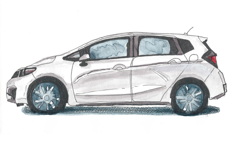
As you can see with the Ford Focus above, I mixed it up with the cool and warm dark neutral shadows to bring interest to a piece that was almost ALL shadows. If the car was only one or the other shadow color, the painting would be significantly more boring in my humble opinion.
Pigment Information Chart
| Pigment | Transparent | Staining | Granulation | |
| Quin Gold | PY150+PR101 | Yes | Semi | No |
| Green Gold | PY154+PBr7 | Yes | Semi | No |
| May Green | PY151+PG7 | Semi | Semi | No |
| Helio Turquoise | PB16 | Semi | Yes | No |
| Quin Red Light | PR207 | Yes | Semi | No |
| Purple Magenta | PR122 | Yes | Semi | No |
| Schmincke Violet | PV23 | Semi | Yes | No |
| Dark Blue | PB60 | Semi-Opaque | Semi | No |
| Transp. Umber | PR101 | Yes | Yes | No |
| Neutral Tint | PR122+PB60 +Pbk7 |
Semi-Opaque | Yes | Yes |
Remember, you never HAVE to purchase more colors. It’s an addiction for many artists so I stopped feeling guilty about it years ago. I like trying new colors and until I finally started to settle into my own favorites, I kept trying. If you’re on a budget, like me, then try to think about which your favorite colors are and analyze what you WANT to paint. That will help lead you to which convenience colors you may want to flesh out.
I paint a lot of green and red things. If you know me, you realize I’ve just recently branched out from fruits & veg into animals and flowers and glass etc. I therefore have five to six greens in my studio palette. I could get by with only about two but I prefer to have more and tweak so I paint faster. Similarly with my red selection. I include any orange or pink or magenta in my “reds” so that would number six or so, lol.
When I’m panting, I may only use two or three in any color group but it lets me move faster with a painting. I let myself learn to paint first, now, after several years of getting comfortable and finding my own style, I’m thinning my palette down considerably. Hopefully I can fit it all into this beautiful palette above, lol. I hope to get it down to 24 half pans. Maybe even get it down to 18 half pans and 3 full pans. We’ll see, that’s the adventure, isn’t it?


Great selection of colors and a good explanation of why you chose them!
I ended up getting the May Green (a convenience color I don’t already have) and the Schmincke Violet (even though I have that pigment in a Daniel Smith tube, I love the smoothness of the Schmincke colors so this will be a good one to compare across brands). I did my math and I was able to add two pans to the custom kit order to get free shipping which effectively cut the cost-to-me of those pans in half. Not sure I’ve made sense, but it was a good deal 😉 Thanks for the explanation of how you use the violet – I’m not sure I’d have thought of that! (I’m pretty new to watercolor)
PS – Jenn, I think you accidentally forgot Quin Gold Hue on your chart – you put in Yellow Ochre instead 😉
So much good and useful information here Jenn, thank you for sharing what you’ve learned in a way I can understand, I am learning there’s a heck of a lot more to watercolors than I ever imagined, it’s fascinating and fun to learn about pigments, mixing colors, all of it! I enjoyed reading why you picked the colors that you have, and how you use them. That painting of leaves is gorgeous!
wonderful intro to the beautiful colours, splendid art!
Love your suggestions! The violet and turquoise were particular favorites of mine! Happy PPF!
Lovely selection of colours, and good to see you again! Happy PPF, hugs, Valerie
Great palette, love the swatches.
awesome art and colors Jenn, and your explanations are just the best-thank you and happy PPF!
I LOVED this post! Thank you, not only for sharing your lovely artwork, but for the excitement of experimenting and learning about new colors. You inspire me. 😀
I haven’t yet taken the plunge with any schminke watercolours (I have sooo many watercolours already!) but this does tempt me. Especially the golds 🙂 Happy PPF from Number 22 😀
I love the colors you suggested to potentially add into this set 🙂
Such a wonderfully informative post. Thank you for sharing your colour choices and why you chose them.
-Soma
Yes, you don’t Have to buy more colours, but you’ll Want to. At least I do. Just can’t resist them. Even if I end up not really using them. They’re just so beautiful to look at, like your colour samples here. PB60 is a favourite of mine too. There’s so many different names for some colours, it’s always useful to know the pigment number. I would have liked to enter your giveaway, but I’m neither in the US nor Canada. It’s the tin itself, really, that I’d like. I found it in an online shop here and had my eyes on it for a while. I don’t really need yet another tin, and I don’t really use this size, but it’s just so pretty…. Beautiful artwork too! Your Bok Choi looks tasty!