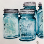
This is my latest ball jar painting. I love painting glass. It’s ridiculously fun. I remember when I first started painting. I looked upon other people’s art where they’d captured the beauty and transparence of glass. HOW did they do that? It looked so complicated. Well, it is and it isn’t. Now that I have a few years of painting under my proverbial belt, I’ve learned how.
![]() I started out with a very small piece. Watercolor pencils were my best friend instead of paint, it gave me more control. I obsessed over the details. OBSESSED. It took me hours of darkening over and over until I got what you see. I loved how it turned out and it made me realize that if you pay attention to the details, you can make something look transparent. I also started learning that shadows and “white” are many different shades. Let me say that again. There will be MANY different shades to your whites and shadows.
I started out with a very small piece. Watercolor pencils were my best friend instead of paint, it gave me more control. I obsessed over the details. OBSESSED. It took me hours of darkening over and over until I got what you see. I loved how it turned out and it made me realize that if you pay attention to the details, you can make something look transparent. I also started learning that shadows and “white” are many different shades. Let me say that again. There will be MANY different shades to your whites and shadows.
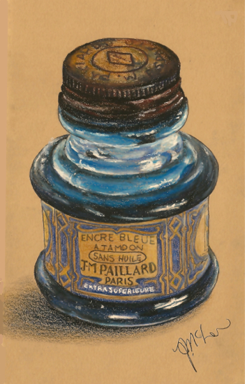
Onward and upward. I think the next piece I did was the old ink bottle. WOW, I remember just how much I had to darken and darken those blue colors around the neck & bottom of the bottle. Another lesson: Your darks will probably be much darker than you think they should be. This was also done in watercolor pencils.
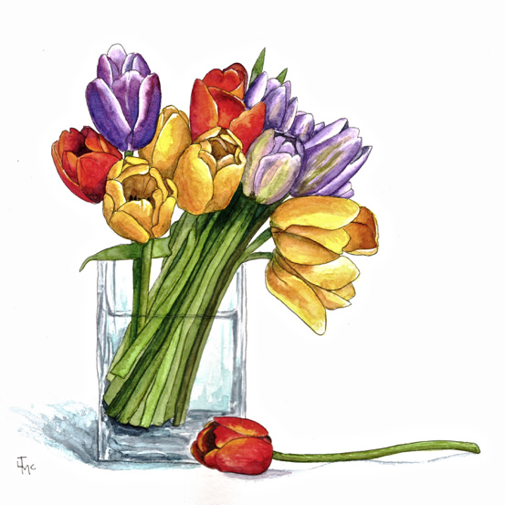
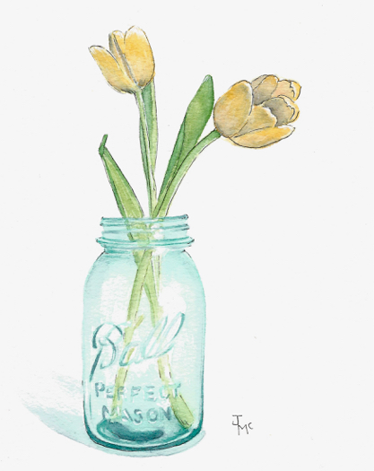 The first time I used watercolor to capture glass, I was using my Da Vinci Trio. I loved how the jar came out but not so much the tulips. They look to delicate too me. I think it’s a matter of personal taste. Some people love that delicate look. I thrive on bright. I’m sure you’ve all noticed that, lol.
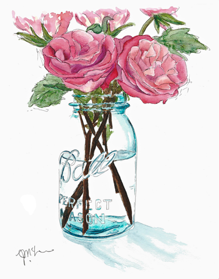
The roses in the ball jar (below) was my second try at achieving transparency with paint. I used Cézanne 140lb hot pressed watercolor paper (review here). The details were much more difficult to paint than I thought they would be. The transition to wet media gave me much less control. It did go a lot quicker though, lol. The paper was great for detail, I just needed to practice brush control. I also had to learn to be more patient because it’s the layer upon layer that gives that beautiful transparency. There’s not as much detail in the ball jar here but you still get the idea of transparent glass. It’s as much what you DON’T paint as what you DO. I guess that would be lesson three of painting glass.
![]()
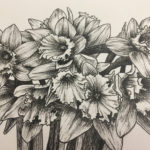
I learned that you needed the right paper for this type of painting. (lesson four, lol) The next painting was in the Nostalgie sketchbook. It can take watercolor but it’s not the best for this kind of exacting detail. The Nostalgie worked great for the daffodils but the ball jar was a little messy. The lettering looks spectacular though. The Nostalgie works best for pen and ink so I’m not surprised, light washes are fine but detail is harder. As you can see, the shadows from the flowers really brings the glass to life.
Tulips, more tulips & glass. I finally thought I was getting good at this “painting glass” thing. Although this painting was much more about the tulips than the glass container, it actually took a ton of time to achieve that transparency. I learned I had to be patient (lesson five!). Add that watercolor over and over, darkening it slowly to get just the right shadow. This was successfully done on Britannia watercolor paper. I actually fell in love with this paper a second time after doing this painting. It’s such a great price and I think it’s an excellent watercolor paper. My first use of it was here with Jenny’s Squirrel.
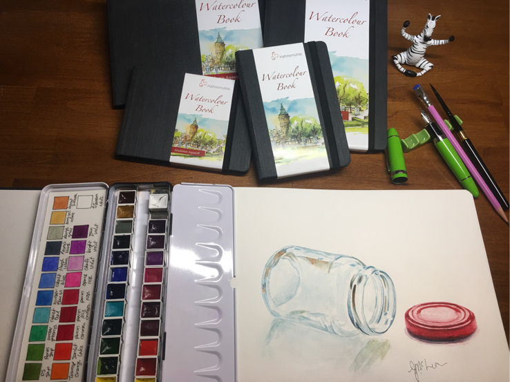
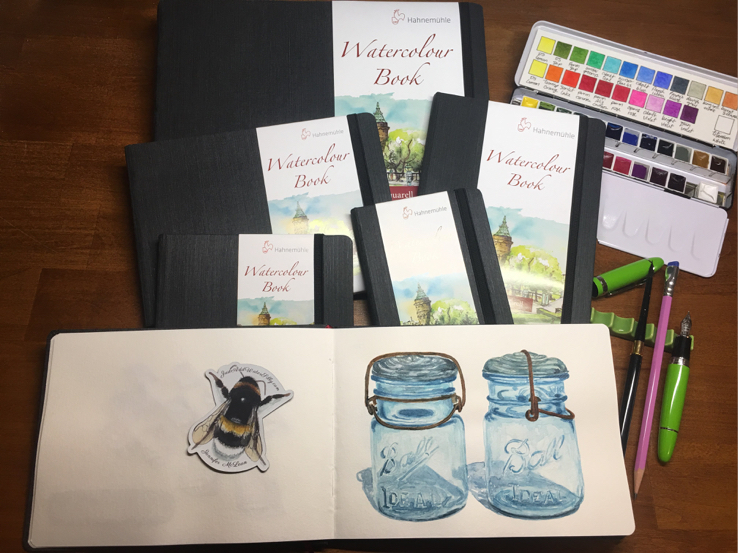
 My two last pieces I gave to a friend for Christmas. The first, “Tip Jar” was such fun. What an accomplishment this one was. It turned out exactly the way I wanted it to. As with the first painting I showed, this was done in Hahnemühle’s watercolor book (review here). “Tip Jar” was in the large landscape and the two ball jars at the top of this post were done in the 6″x8″ landscape. I ended up cutting “Tip Jar” out of the sketchbook to give it as a gift. Yes, I know that’s cringeworthy but sometimes ya gotta do what ya gotta do and Carol deserved this painting. If you’d like to see that Christmas present project, go on over to YouTube and check out my video.
I also sent her a piece from my Greybook. The grey color of this paper is awesome but it does only take dry media though. I mightily wish that Hahnemühle would make this paper into multi-media paper. They could call it Mrs. Greybook, it would look much like the original Greybook but would do more things. ;o)
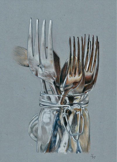
The Forks took me a ridiculously long time to complete. Something like 13 hours. It’s all in the details. Get your proportions right first. (final lesson) then start adding the details in light strokes. Darken, darken and darken some more. You’ll get there in the end and then you too will be able to create the illusion of something transparent and three dimensional on a flat piece of paper.
Lessons Learned:
- There will be MANY different shades to your whites and shadows.
- Your darks will be much darker than you think they should be.
- It’s as much what you DON’T paint as what you DO.
- You needed the right paper for this type of painting.
- Be patient, add details in layer after layer.
- Get your proportions right first. (this probably should have been the first lesson, lol)
If you want to purchase Hahnemühle paper, just click on my icon in the sidebar. There you’ll find all the links to the papers I’ve tried so far. Happy painting!


This is a wonderful post. Glass kind of tickles my brush hand, but so far I haven’t worked up the courage to give it a go. Your post inspires me.
Wow Jenn, what a wonderful pieces of art – painting glass is a talent I admire and will never achieve (watercolor is just not my ‘thing’ and I have other talents… so I’m not jealous) but wowzah – how good you are with it!
Love these Jenn and what a great idea to start with pencil. And pencil on colored paper esp. I think I need to stop at the antiques mall tomorrow and get and intersting jar or two.
Do you prefer working from photos whe doing glass? I would think real life is nice, but nice to take a picture of before the light changes. 😉
GREAT question Tracy.. I had meant to mention that. I always use a photograph of my glass still life for ONE specific reason. The light over time will change and the shadows will change significantly as I try to capture the glass without a photo. If I had cool glass objects I’d just photograph them in great light with wonderful shadows!
Tbis is a great artical Jennifer. Your glass is amazing. . I am sure it will take a lot of practice for me but I will give it a try. So glad you are feeling better and doing well now.
Glass is something I haven’t tried to paint because it appears to be so difficult. Thank you for the encouragement to give it a try! Your glass is amazing!
great article, Jennifer! I have long admired your transparent pieces of art. so beautiful! and I like your Hahnemühle where-to-buy page. I need to do something like this on my site. I’ll have to think about it.
Hi Alice, feel free to copy and paste if you want to or even just tell me when you’re doing it and I can send you some of my links already done. You have so many more followers and all those people probably hunt for Hahnemühle paper too. We can help each other! Hugs, thanks for the co moment my friend.
Great glass! I find the transparency difficult to capture, but I keep trying. I’ll have to give w/c pencils a try for glass. Thanks.
Your work just blows me away, Jennifer! Whether it’s glass or fruit or animal, it’s always amazing!
Your prices are just delightful. I have not yet tried any glass
This was a very helpful post. I’ve been working with watercolor for a little while, and I still struggle with starting light and building up the color slowly. I rush the process. This was an excellent reminder to practice patience more! Your glass paintings are gorgeous.
Thanks for this lovely post!! I’ve always been one of those artists that looks at glass paintings in awe, thinking that they aren’t achievable without weeks or months of painstaking work, the kind with plenty of tears involved. Lol! I see though that with plenty of practice you’ve really achieved a gorgeous result!! It gives me hope to try practicing it myself! I have plenty of rainbow colored bottles that would look amazing in the sunlight if I can pull it off.
Anyway, thanks for the tips and I’ll be sure to keep them in mind!!
Another fantastic post Jen, it’s got me curious. Would you consider doing a week long challenge with a min lesson each day to introduce the skill or technique needed for the next day’s challenge? Would be happy to help organizing if you need it!
The way you use white space on paper, use shades of whites, grays, blues, the light source.
With I had the files from your mind palace! Lol