 Pigment information about watercolors help make the artist better at their job. Your job is to bring your vision to life on paper. When you learn all about your paints, you’ll paint better. You’ll also SAVE MONEY. We all want to save money, right? We all want to be good artists, right? Ya. We agree.
The pigment information for each tube or pan of paint will tell you about transparency, lightfastness, granulation, staining ability and the number of pigments used to make that color. It will also tell you the Color Index codes and pigment numbers which are very important. That’s where you’ll save money! All of these bits of information are necessary for different reasons.
Color Index Names & Pigment Numbers
The chart below shows you what the letters mean in the Color Index information for a paint. The letters correspond to the group that the paint is in. For instance, let’s look at two comparable paints. Depending on the brand, Burnt Sienna can be made with different pigments. Schmincke makes their transparent Sienna from PR101. While Daniel Smith’s Burnt Sienna is made with PBr7.
PR refers to Pigment Red so the Schmincke’s transparent sienna is part of the red group of pigments. It’s pigment number is 101. Daniel Smith’s burnt sienna is part of the Pigment Brown (PBr) group and it’s pigment number is 7. The reason I chose burnt sienna as my example is because this was the first paint color that I really struggled with. Eventually, I realized something after lots of research and looking at tons of swatches online. I didn’t like the PBr7. BUT I DO LOVE PR101. I’m sure you will come across your Achilles heel when it comes to paint. Understanding the pigment information will help you know why you like or dislike a color.
Groups of Color Index Names:PW = Pigment white |
One last thing about pigment numbers. Sometimes you’ll see extra numbers after the index code+number. Usually it’s after a colon. Like this…
Phthalo Blue’s color index is PB15 but depending on the shade of the color, there is additional information. Schmincke’s phthalo blue is PB15:1, their phthalo sapphire blue is PB15:6. Their Helio Cerulian which is actually also a phthalo blue, is PB15:3. This extra info also helps artists make decisions on shading. My good friend Tracey Fletcher King has done an entire art show all about blue so it would matter to her whether a phthalo is one shade or another. Knowing the difference, allows you to save money. KNOWING the info of a pigment stops you from duplicating a color when it’s not named “correctly”.
Now you’ll know NOT to purchase another Phthalo blue if you already have Schmincke Helio Cerulean! Of course, if you’re like Tracey, you’ll want them ALL. But, ya know, thats a problem for another day.
The number of pigments in a color matters.
 There are two reasons for this: One, the more pigments within a color, the less good it is as a mixer. Two, knowing what makes up a color allows you to not get similar colors, hence less wasted money!
It’s not like you can’t use a three pigment color as a mixer but it’ll be much more muddy than other colors you mix. For instance, I in my earlier years of painting, before I learned all this stuff, I couldn’t understand WHY when I mixed Daniel Smith’s sap green with other colors, I always got sludgy mixes. Now I realize that DS sap green is a three pigment color. When I mix it with another paint, even if it’s a single pigment, I’ll tend to get muddier results. Since I like bright, clear colors, this isn’t a place I want to venture. DS sap is an awesome color but I’d use it on it’s own. Knowing the pigments it’s made up from helps me remember why I use it on it’s own. It also allows me to mix my own, similar color if I want to!
The second reason you want to know which pigments make up your paints is so, again, you don’t duplicate colors that are already close to each other on the color wheel. It’s so hard to tell when looking in a store or online if paints are similar. Knowing what pigments make up the paint helps you know if you’re duplicating similar colors.
Other Pigment Information
 Granulation – I don’t love granulation much. Many people love it. So knowing this pigment information, which colors are granulating, is important to me. I haven’t moved into painting nature scenes, water, trees and other textural elements so maybe I’ll start to love it when I do.
Watercolors are ground up pigment combined with binders. With select watercolors, granulation happens when some of the pigment separates from the binder and settles into the valleys of the paper. As it dries, the pigment falls in and out of suspension which leaves the paper looking textured and grainy. This is great for sand, water, mountains and anything else you want to make look textured.
Some pigments are more granulating than others, for instance Ultramarine blue. Most iterations of Ultramarine are highly granulating. Many artists look for granulation in some of their paints as they love that strangely wonderful texture that happens spontaneously. When you want to create that textured look, you have to know which watercolors to choose.
Staining Ability – This refers to the amount of pigment that gets left behind even if you sop up your paint after laying it down on your paper. Staining colors will also leave paint on your fingers and stain your clothes, sometime permanently. Phthalos are well known to do that. It’s not a good reason not to use a color, but you may want to be careful to steer away from a good white shirt when you’re painting.
When many artists are making art, they may want to plan whether certain sections are done with staining colors. If you plan to scrub up color to create a certain look, you may not want to use staining colors. You will not be able to get back to white paper with staining colors.
Transparency – I’ve talked about this before. I absolutely LOVE transparency with my watercolors. Although one always has to balance transparency with the colors you’re looking for and single pigment colors, I do highly value the most transparent paints. I think, other than pigment numbers, transparency is the most important pigment information I can get.
Transparency is most important when glazing. Glazing is putting one thin layer of color over another. The transparent and semi-transparent watercolors make the very best glazes because then you can see through to the next layer of color and it gives wonderful depth to your paintings. If you put a more opaque color overtop, you lose that “seeing though” aspect because opaque means NOT see-though, lol.
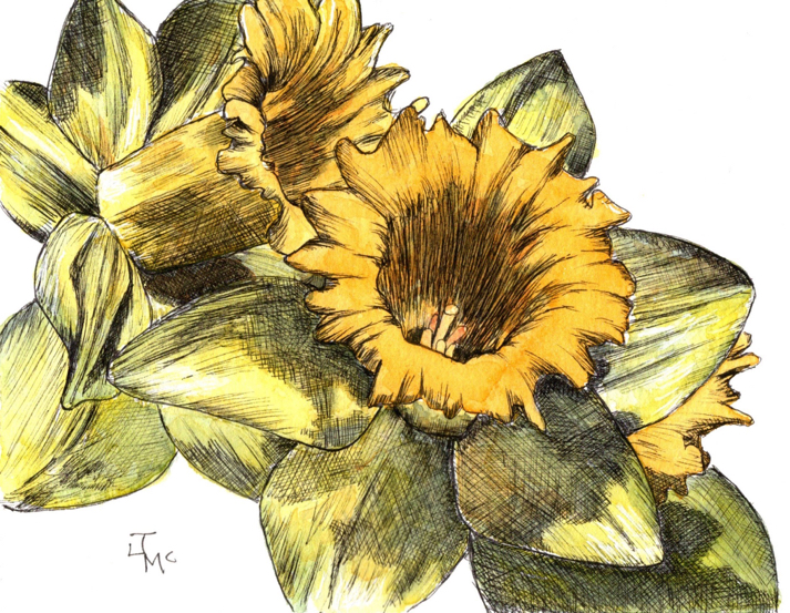
Knowing which of your watercolors are THE most transparent helps you create more luminescent art. For instance, I use my most transparent Pure Yellow in all underpaintings. This allows for a glow in all subsequent layering. It’s one of the biggest tricks I use.
The above drawing/painting of Daffodils wouldn’t have worked if I’d used cadmium watercolors. Cadmiums are opaque or semi opaque. I did the heavy lifting for this piece with Zebra Technical pens. If I’d then put opaque watercolors over top of the pen, you wouldn’t see the crisp lines that make the painting dynamic.
One Last thing On Pigment Information
There is one last reason to want to know and understand pigment information. That is, it elevates you. It gives you power. Knowing more about your own paint gives you knowledge and that can only empower your own self worth and self esteem as an artist. There are many awesomely talented artists who could care less about pigment information, and that’s ok. I, however, use it to power up my own abilities. I feel like it gives me a solid foundation to build skills on. But don’t fret, JUST PAINT. The information will come if you’re open to it. You don’t have to understand it all now. Just knowing you want to know it will help you soak it all up organically. My biggest piece of advice is to..
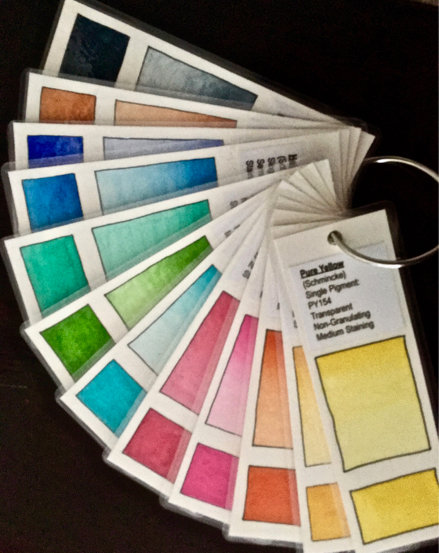
In the next post I’ll be talking about making your own swatch cards using all that pigment information. Just like the picture at very the top. It’s a great way to keep all the above information in the same place. You also then get to stare at all your puurrtttyyy colors and isn’t that just the best?
In Other News…
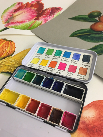
I will be making a PDF to help corral all this information into one place. The PDF will include how to mix colors, transparency, granulation, staining, pigment information, choosing paper, and many, many more topics. It will work with any palette but is based on the custom Schmincke palette. It will be on sale on here sometime in the next few weeks so watch this space!
Finally…

Wet Paint has now sold almost every single palette that will get a Bumble magnet mascot! 300 Custom Schmincke Palettes have been sold so if you want one you really might want to move faster rather than slower. This is a limited edition tin and they’re RUNNING out the door! YAY! I’m so glad everyone likes the colors I chose. Congratulations to those who have indeed purchased, enjoy your very own Bumble. I personally included them and he comes with the first 300 palettes. You’re welcome. He’ll buzz around your house when you’re not looking, then rest on your fridge to keep you company.
If you’d like to learn about this palette go here. Read all related posts so far here. Click the palette below to Pre-order. It’s such a beautiful tin and all those gorgeous colors could sway the most miserly to break open their wallet!


Very nice! I look forward to the PDF
Love your posts. I order the Schmincke palette early on when you announced it so I’m hoping mine will come with a bee. True confessions here…the bee was the selling point. I think I wanted that more than the palette 😉 You need to make more and sell on their own. If you already do and I haven’t stumbled onto them, forgive me.
Great information! I love your daffodils!
As always, great information! Thanks for so generously sharing.
Your posts are always so informative and helpful, Jenn. Thank you! 🙂
PS: I’m also not a huge fan of granulation. Do you have a list of non-granulating staple faves?
More great information Jenn! Alas, I think I know more about pigments than painting at this point – what a challenge to unravel as I started on my watercolor journey! I’m glad you highlighted burnt sienna – it’s one of the reasons I just hate “how to paint” resources that list only paint names and not the pigments!